Search This Blog

Thursday 25 July 2013

Algonquin Inspiration

A couple of weeks ago, I went on our second annual Women's Canoe Trip in Algonquin Provincial Park. We spend 4 days and 3 nights in the interior taking a different route than last year so the scenery was also different...as different as rocks, trees, and water can be. On this trip we saw more rapids and waterfalls than last year and did less river travel. I had brought along my sketching gear but found that I could not relax enough to sketch. I did do a couple of sketches but ended up taking a lot of photos as well. So when I arrived home I set out to sketch from my photos. Last year I made a card as a memento of our trip for each participant. So this year I wanted to do the same. I've been working feverishly to try to get them done. The scenery is so inspiring to me that I think I will be using my photos to create several paintings and also possibly some fabric creations.
Below are half of the sketches I've completed. They were drawn on watercolour paper with a permanent ink pen and then painted with watercolour pencils. Check back next week when I'll post the rest.

"Island Campsite"                           Galeairy Lake, Algonquin

"Tall Pine"                                     Galeairy Lake, Algonquin

"Water Bucket"     Galeairy Lake, Algonquin

"Portage at Rock Lake Dam"               Rock Lake, Algonquin

"Misty Morning"                           Clydegale Lake, Algonquin

"Lily Pads"                                             Pen Lake, Algonquin

"After First Portage"                      Galeairy Lake, Algonquin

Thursday 18 July 2013

Inspired by the Aluminum Pop Can

Have you noticed that the aluminum with which pop cans are made of, at least in Canada, has become quite thin. While it is in the pop can shape, it is very strong and durable. However when you cut a pop can up such that you cut the top and bottom off, you are left with the middle of the can which is not much thicker than aluminum foil. You can cut it with a regular pair of scissors. I love the gloss on the outside of the can and even some of the graphics. Take the Coke cans. It's a pretty iconic can and instantly recognizable.

I thought it would be interesting to use this metal in my art to give it some glitz and colour and maybe bring up some fun memories for people. In experimenting with the aluminum I used both the front (coloured advertising side) and the back (the silver aluminum inside of the can) on some fabric cards. Due to the fact that the edges of the cut metal can be sharp I had to be very careful working with it and when putting it onto my art the edges had to be covered so as not to cut people handling the cards. I've also found that you can sew the aluminum with a sewing machine if you have a heavy duty needle so I usually zigzag it down as a way to cover the sharp edges.


Some examples of cans I have used, whole cans and a couple that
I cut the tops and bottoms off of.
This card was made with the apple juice can aluminum.
This card was made with the back side or inside of the aluminum can.


Thursday 4 July 2013

Paris Journal

I wanted to make a unique journal about the trip my sister and I took to Paris in April and so when we were there, we went into a used book store and I found a French hard cover book entitled "La Terre" which means "the Earth" by Zola. I loved the design on the cover.
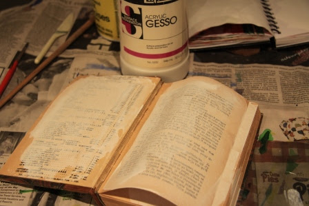
I took the book home to Canada and planned to make my Paris journal out of it. To begin, I tore out several pages to make room for the things I would be putting into the journal. Then I used Gesso to paint and seal the pages so that I could draw and paint on them without the paint going through the page and weakening it.


Once the pages were dry, I began adding photos, paint, drawings, words, and things I had collected while in Paris. It is not totally finished yet but I've gotten a good start on it. I think my scrap booking friends would say that I was scrap booking which is ironic because I always said I wasn't into scrap booking. Funny.


I like how the typing on the page comes through some of the images and because it is all in French, it adds to the French flavour of the journal.